
Project Overview
I led the designs for a rush, mid-century–inspired press release campaign announcing Mad Men on HBO Max. The goal was to introduce the show on its new platform in a way that felt intentional, premium, and deeply rooted in the show’s DNA—rather than a standard “now streaming” announcement.
The Brief
The initial brief centered on the idea that Mad Men was now “in good company.” Mad Men is a premium show, HBO Max is a premium platform, and the creative needed to reflect that shared status.I was brought onto the project late Thursday with the expectation that the campaign would be live by Monday EOD. Because of a thorough approval process, initial concepts needed to be presented by Friday morning, refined over the weekend, reviewed Monday, and delivered as final files by 3 PM. The timeline was tight, with little room for iteration.
I have a deep love for Mad Men, but more importantly, a longstanding interest in mid-century design and advertising. That made this feel like a dream project—one where the visual language could do most of the storytelling.Rather than simply referencing the era, I wanted the work to feel as though it had actually been created during it.
Concepts
I initially presented multiple concepts that stayed close to the core idea of the brief: creating mid-century–inspired ads that promoted HBO Max’s most popular shows as if they were clients of Sterling Cooper Draper Price.
The concept included four posters—each for a flagship HBO Max series—executed in the style of 1950s and 1960s advertising. The shows we wanted to feature were :
The Sopranos
IT: Welcome to Derry
Succession
House of the Dragon
The White Lotus
Visually, I leaned heavily into recognizable mid-century aesthetics: hand-painted motifs, screen-printed textures, vintage imperfections, muted color palettes, and yellowed paper filters to evoke age and authenticity.
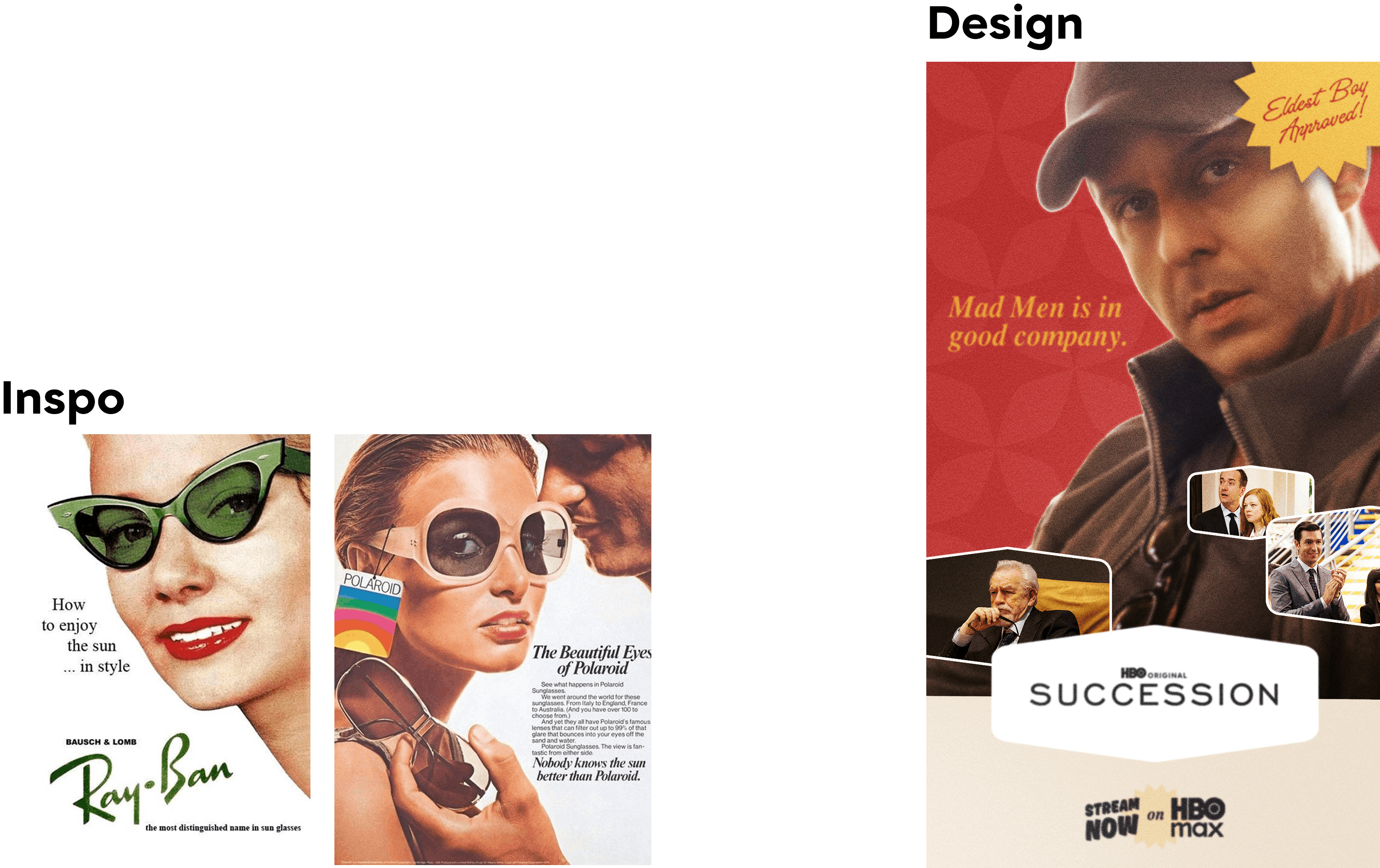
Concept #1 - Airbrushed Models
I’d be remiss not to include a concept that leaned into the classic airbrushed look you see so often in mid-century ads. For this one, I built the design around a great still I found of Succession’s Jeremy Strong that already felt right at home in an MCM layout. The soft gradients and slightly idealized treatment gave it that period-specific polish, and it worked well as a system—something that could easily be adapted across the other shows while still feeling cohesive.
Concept #2- Newspaper Products
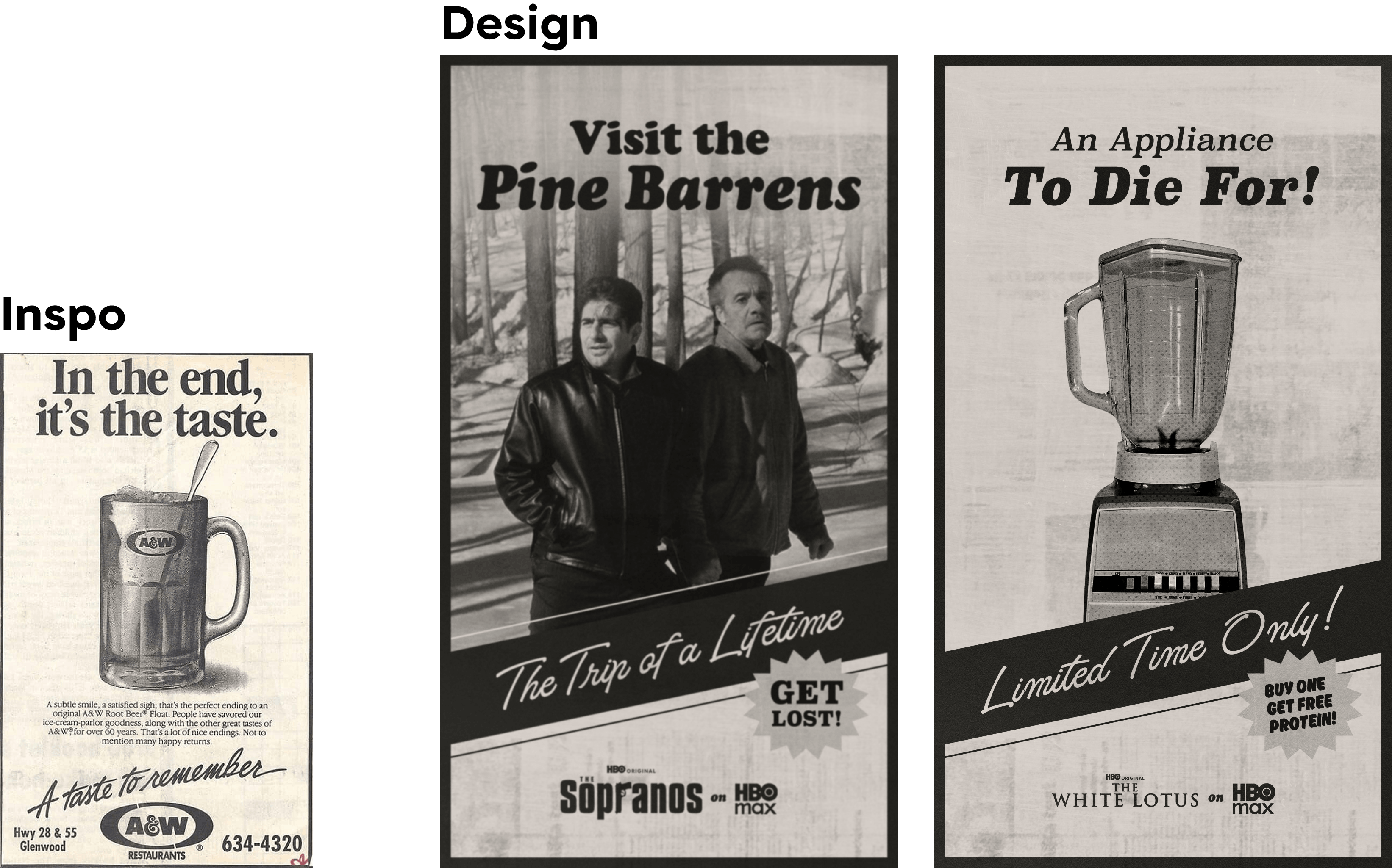
I went a little more meta with this idea and explored ads for products or services that exist within the shows, rather than advertising the shows outright. One concept pulled from the iconic Pine Barrens episode of The Sopranos, while another nodded to the killer blender from season three of The White Lotus. Framing these as newspaper ads felt like a smart way to ground them in the era—and it also created a flexible system that could easily carry across all the shows while keeping everything visually unified.
Concept #3- Collage
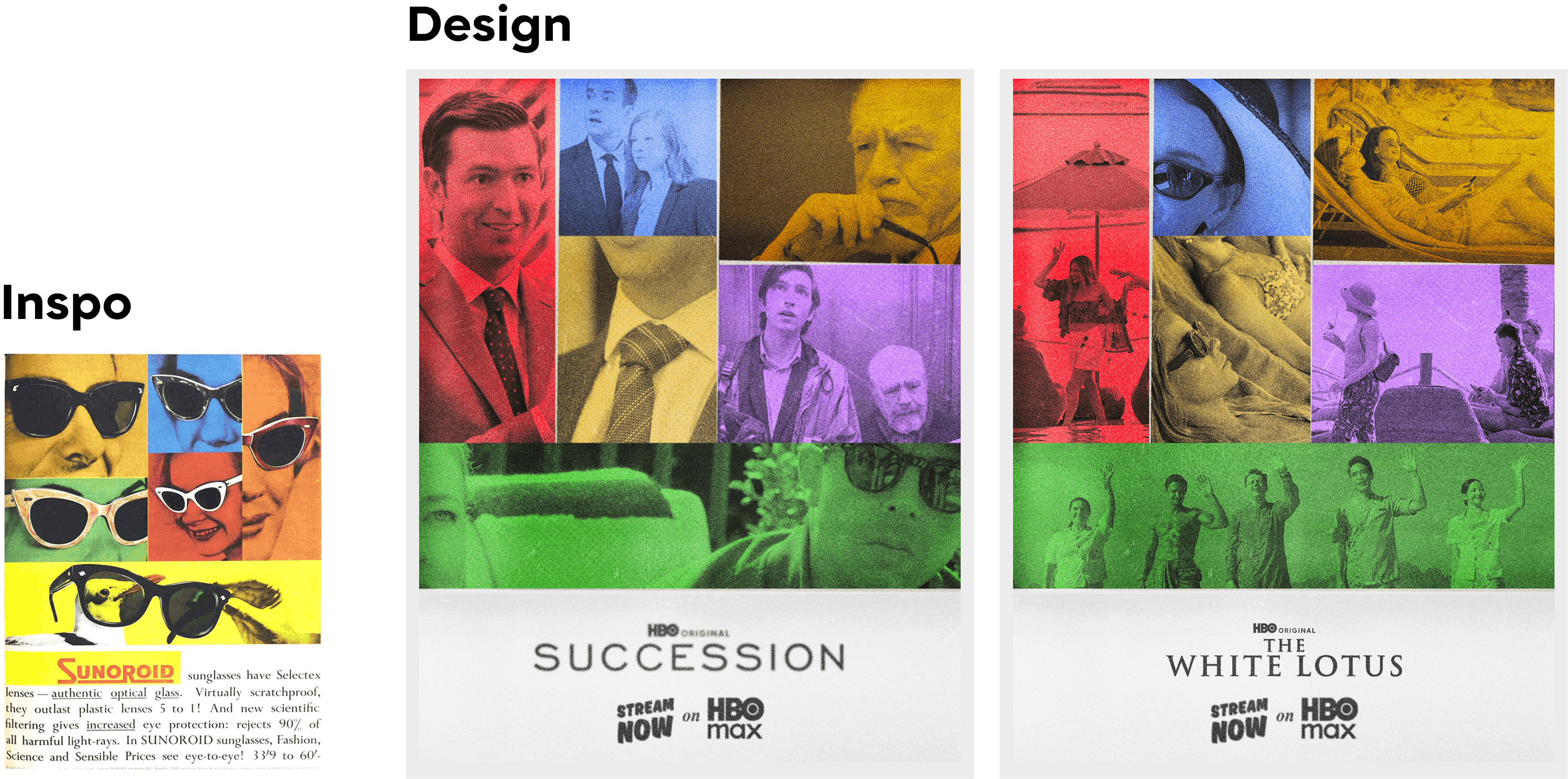
Since this was such a rush project, I was definitely thinking about timeline and what would realistically get approved in time. This was a fallback concept I offered in case things got even tighter than expected—a super simple template where we could easily swap in stills from the other shows while still keeping that vintage, period-specific feel.
Concept #4- Grocery Product
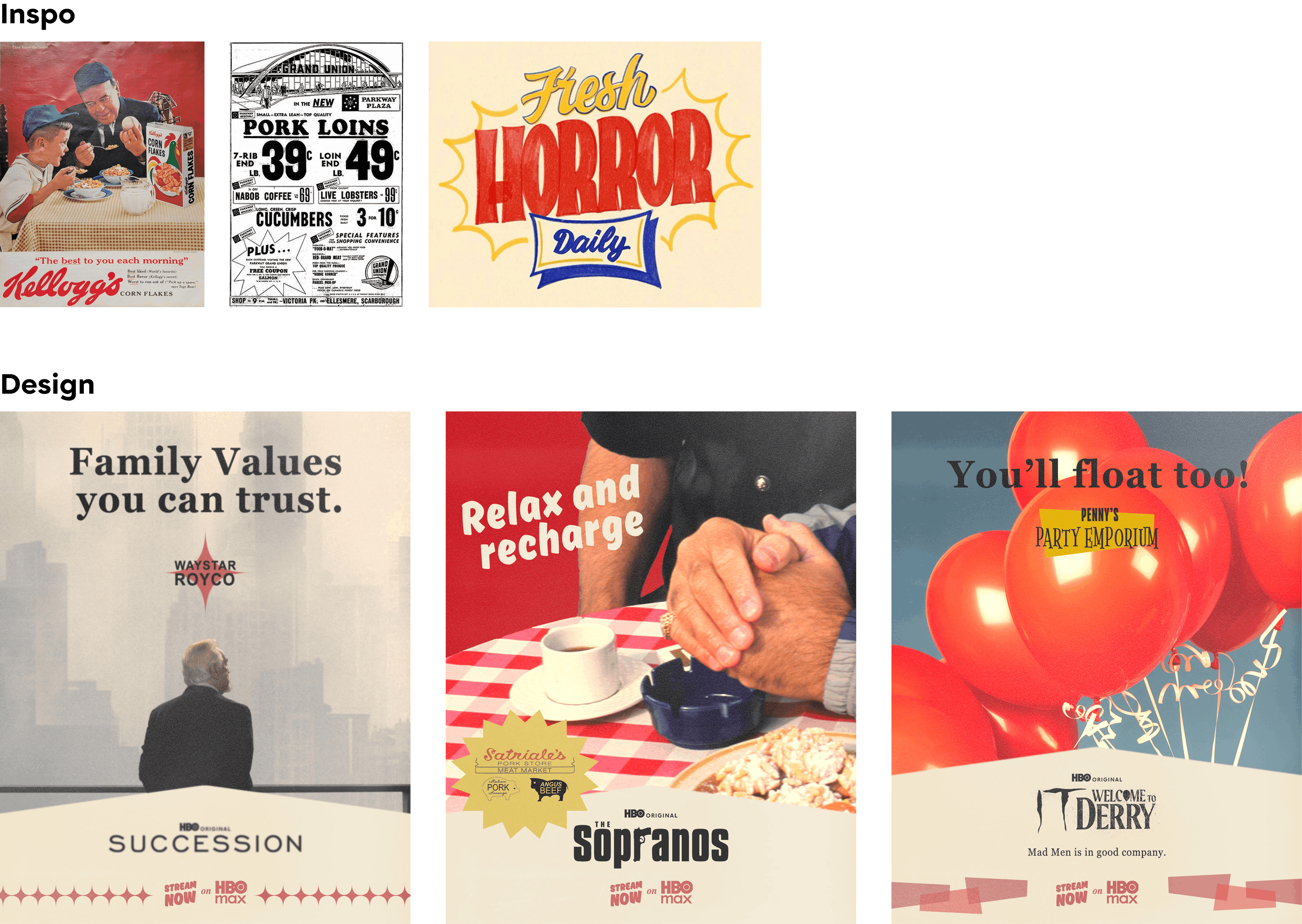
This was another meta-style idea where I leaned into advertising products or services again, but with a more business-focused angle. The concepts featured Waystar Royco from Succession, Satriale’s from The Sopranos, and an imagined party store Pennywise might run selling balloons. I pulled inspiration from classic grocery inserts, using hand-painted prices and deal callouts, and pushed red heavily since it was such a dominant color in mid-century advertising.
Concept #5- Hand Modeling and Zoom Ins
This last concept—and my personal favorite—really leaned into the bold, popular colors you see throughout mid-century modern design. I used zoomed-in 50s/60s motifs paired with eye-catching headlines, and highlighted the kind of hand modeling that was used constantly in ads from that era.
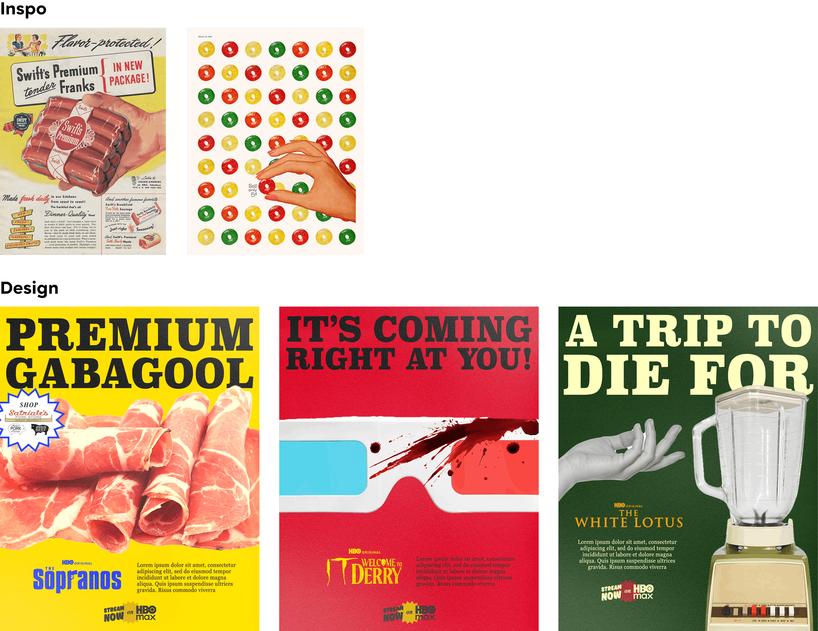
The Riskier Concept
Alongside the safer concepts, I included one idea that felt riskier—but important to show depth of thinking. This concept reimagined iconic real-world ads that appear in Mad Men and function as major plot devices, spoofing them to promote HBO Max shows instead.
I referenced famously recognizable campaigns such as:
The Volkswagen “Lemon” ad
The Life Cereal ad
The Alcoa Aluminum ketchup ad
I was concerned this idea might not move forward due to legal constraints and the already compressed timeline.
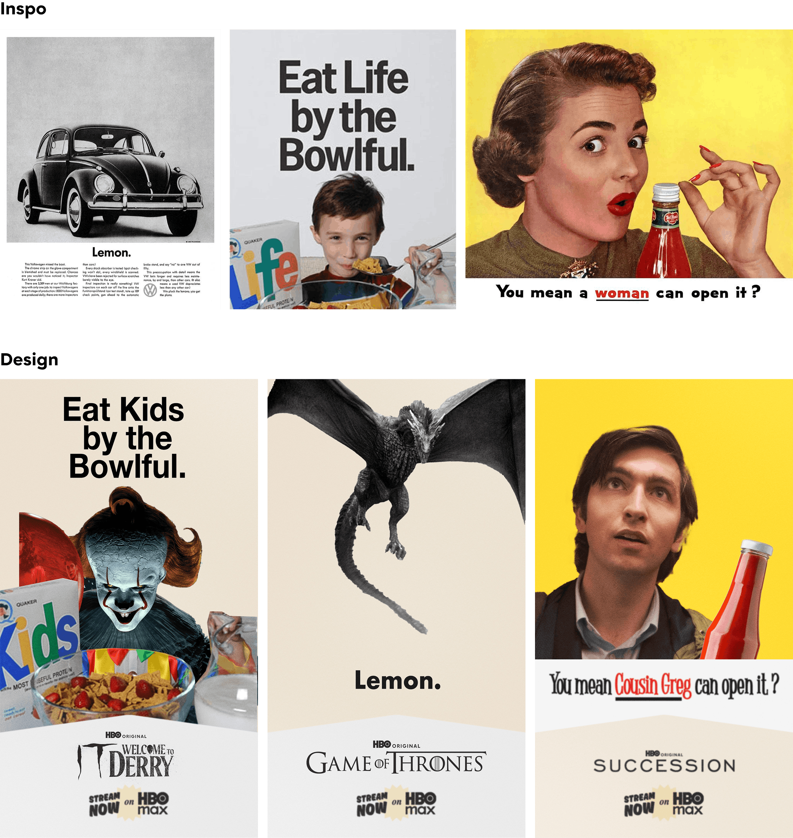
To my surprise, this was the idea that resonated most. With some collaboration, we refined the execution and finalized a set of ads inspired by:
The Volkswagen “Lemon” ad
The Life Cereal ad
The “Pass the Heinz” ad
The Bethlehem Steel ad
Although this was a pivot from the original brief, it felt creatively rewarding to see the concept evolve and get approved. I spent the weekend refining the posters, which required extensive compositing and Photoshop work to ensure each show was immediately recognizable while preserving the integrity of the original ads.
Final Pairings & Execution
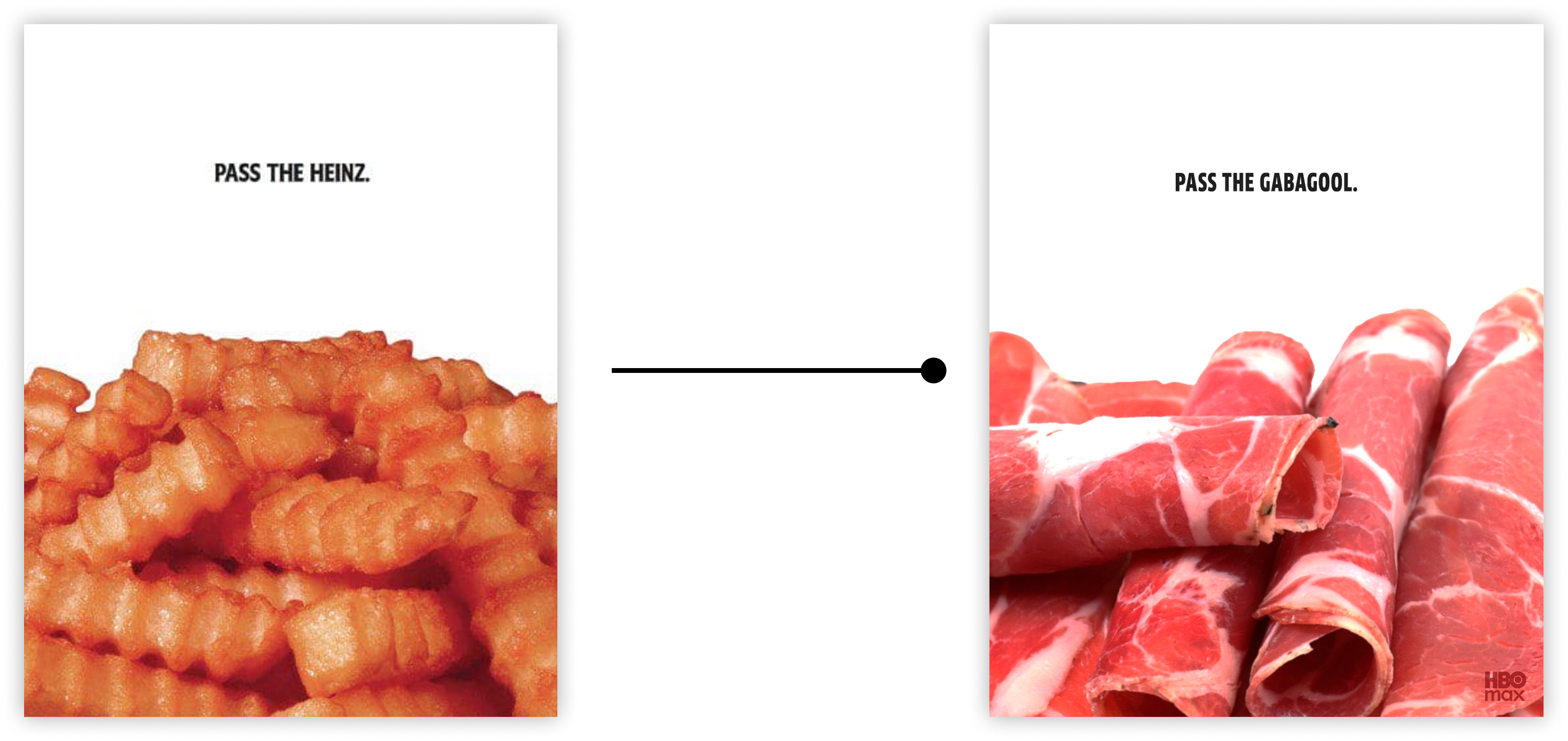
The Sopranos × “Pass the Heinz”
Reimagined as “Pass the Gabagool,” a nod to the viral meme and the show’s cultural footprint. I sourced a close-up image of deli meats worthy of Tony Soprano himself, keeping the tone playful while staying true to the original ad’s simplicity.
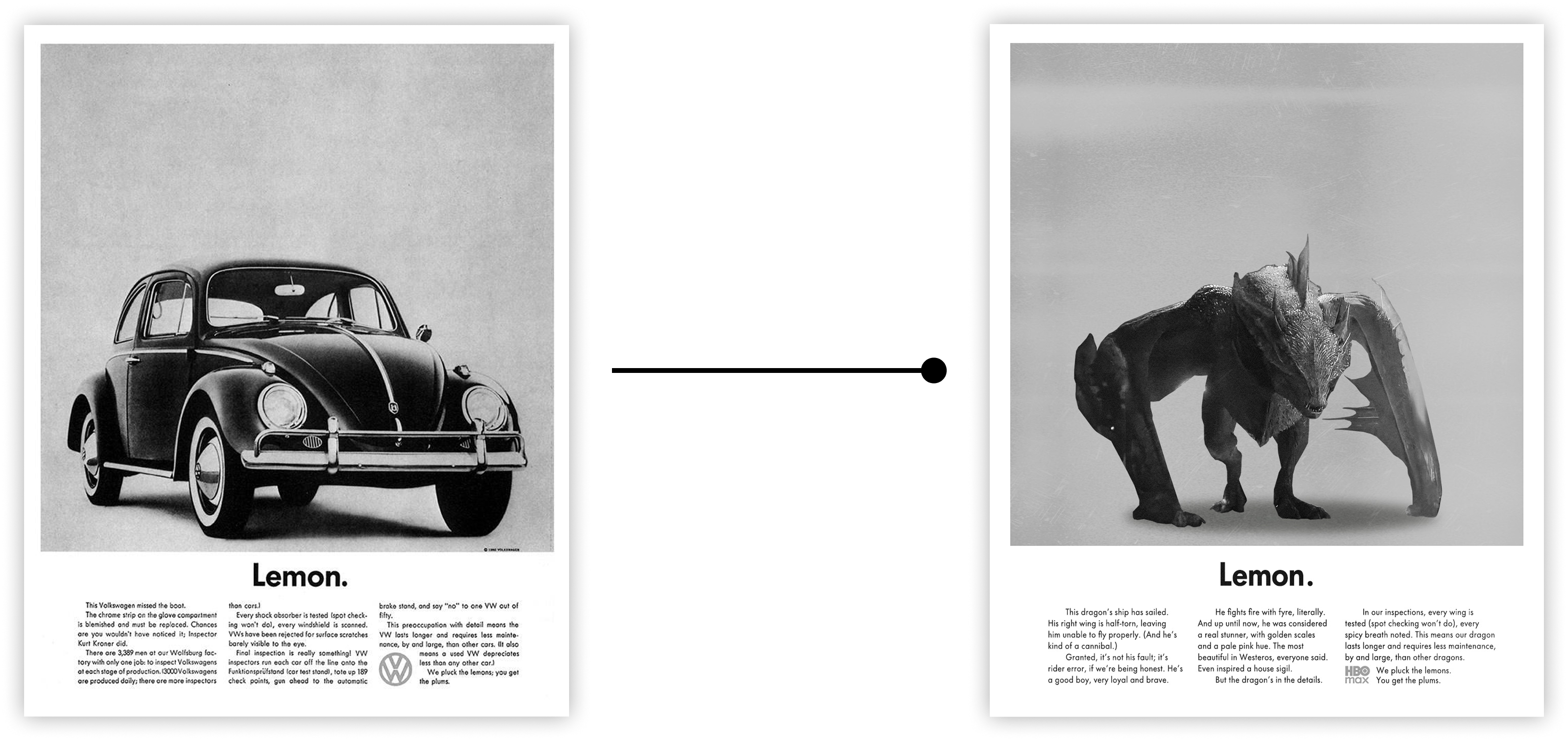
House of the Dragon × Volkswagen “Lemon”
Dragons function as transportation in the series, making the car analogy a natural fit. Sunfyre was chosen as the “lemon”—not because he’s faulty, but because he’s underestimated at first glance. This mirrored the original ad’s message about perception versus reality.
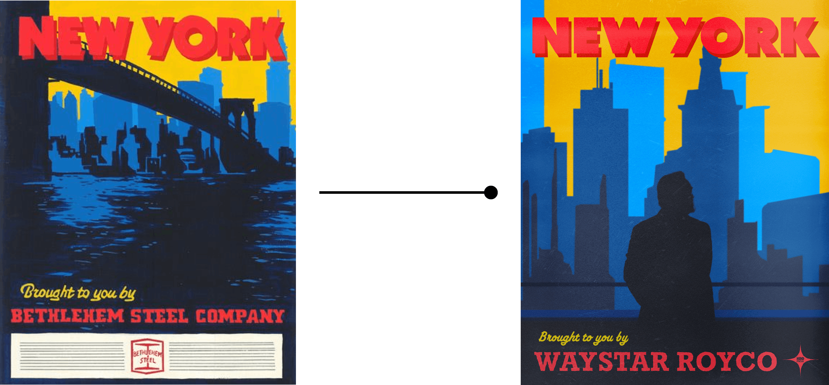
Succession × Bethlehem Steel
With Succession rooted in New York, the Bethlehem Steel ad’s iconic imagery of the Brooklyn Bridge and Manhattan skyline felt like a perfect visual and thematic match, reinforcing ideas of power, legacy, and industry.
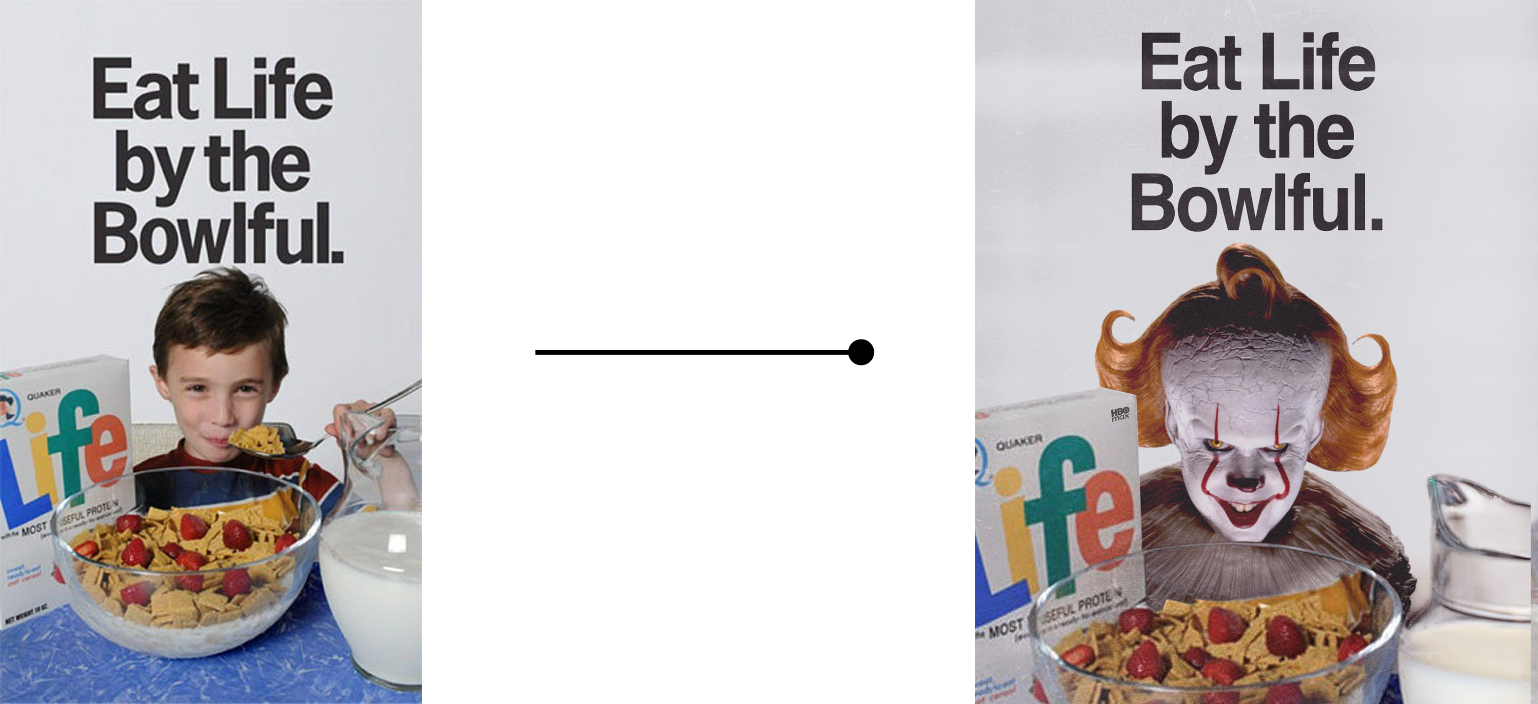
IT: Welcome to Derry × Life Cereal
Pennywise eating children “like breakfast” made this pairing feel almost inevitable. Unfortunately, due to timing constraints and the inability to secure approval from Skarsgård’s team, this execution had to be scrapped.
The Result

The final campaign consisted of four highly crafted, insightful fake ads that were distributed across media channels to officially announce Mad Men on HBO Max. Despite the short notice and demanding timeline, all assets were delivered on time.
This project ended up being one of my favorite pieces of work—both creatively and personally. It pushed me to move fast, take smart risks, and fully lean into a visual language I genuinely love.


