
Project Overview
For HBO Max’s Latino History Month campaign, I led visual design across a full suite of in-app components celebrating Latino creators, talent, and storytelling. Working under the creative direction of my Creative Director and Art Director, our team collaborated closely with HBO Max’s multicultural marketing partners to ensure the work was culturally engaging, sensitive, and inclusive.
Because the campaign lived in high-visibility areas of the HBO Max app during a major cultural moment, the work required close coordination with multiple internal teams as well as external talent representatives. Each design passed through several rounds of feedback, reviews, and approvals to ensure respectful use of talent likeness and alignment with brand standards. I partnered with another designer throughout concept development, with both of us producing multiple design directions. My concept was ultimately selected as the final live design and expanded across the full campaign.
The Challenge
Designing for Latino History Month presented several unique challenges:
Process & Collaboration
Concept Development
Working alongside another designer, we developed multiple visual concepts based on direction from our AD and CD. These explorations were informed by guidance from the multicultural marketing team to ensure cultural relevance, sensitivity, and authenticity. Concepts were refined through iterative feedback and check-ins as they progressed through multiple layers of review.
I designed a number of concepts but these were my favorites that I think should get some fanfare:
Concept #1 - Papel Gradient
I drew inspiration from papel picado, a visual staple in many Latin celebrations. Its color, movement, and sense of joy aligned naturally with the spirit of Latino History Month. I wanted to reinterpret this tradition through a more modern lens by pairing it with bright, almost neon gradients inspired by Latin textiles and tapestries—creating something that felt celebratory, contemporary, and distinct from past campaigns.
The concept simplifies traditional paper-cut motifs into bold, graphic forms, with gradient accents along the edges to add depth and energy. The connected motifs guide the eye across the composition, creating movement without competing with the featured talent.
To reinforce cohesion across the system, I carried the digital, dotted gradient texture into the logo as well. A subtle grain rises from the bottom of the mark, tying it back to the broader visual language and ensuring the entire campaign feels unified.
Concept #2 - Paper Collage
I explored a collage-driven concept, leaning into a style that plays to my strengths and felt well suited to this campaign. While incorporating talent within paper-cut outlines introduced some risk, it offered a fresh approach that ultimately reinforced the collage aesthetic and helped the concept stand apart. I brought that same paper-like effect by choosing a specialty typeface that looked like paper for the logo.
The design brings together a range of Latin-inspired textures and motifs—tiles, fans, piñata paper, and foliage—layered to create depth and movement. A unified duotone color grade was applied across elements to ensure visual cohesion while preserving texture and energy throughout the composition.
Concept #3 - Mural Painting
I also explored a mural-inspired direction built around painterly assets with bold, chunky brushstrokes that felt expressive and playful. For this campaign, we were asked to avoid floral motifs since flowers had been the primary visual theme for AAPI Month. While florals are often effective in heritage celebrations, this constraint pushed the concept in a new direction.
Instead, I referenced nature more indirectly through foliage and wildlife. Parrots and toucans emerged as recurring symbols across many Latin cultures, so I incorporated a parrot and leaves into the composition to add character and vibrancy. To reinforce the hand-painted feel, I selected a typeface with rounded, chunky serifs that echoed the organic quality of the brushwork, helping the entire design feel cohesive and intentional.
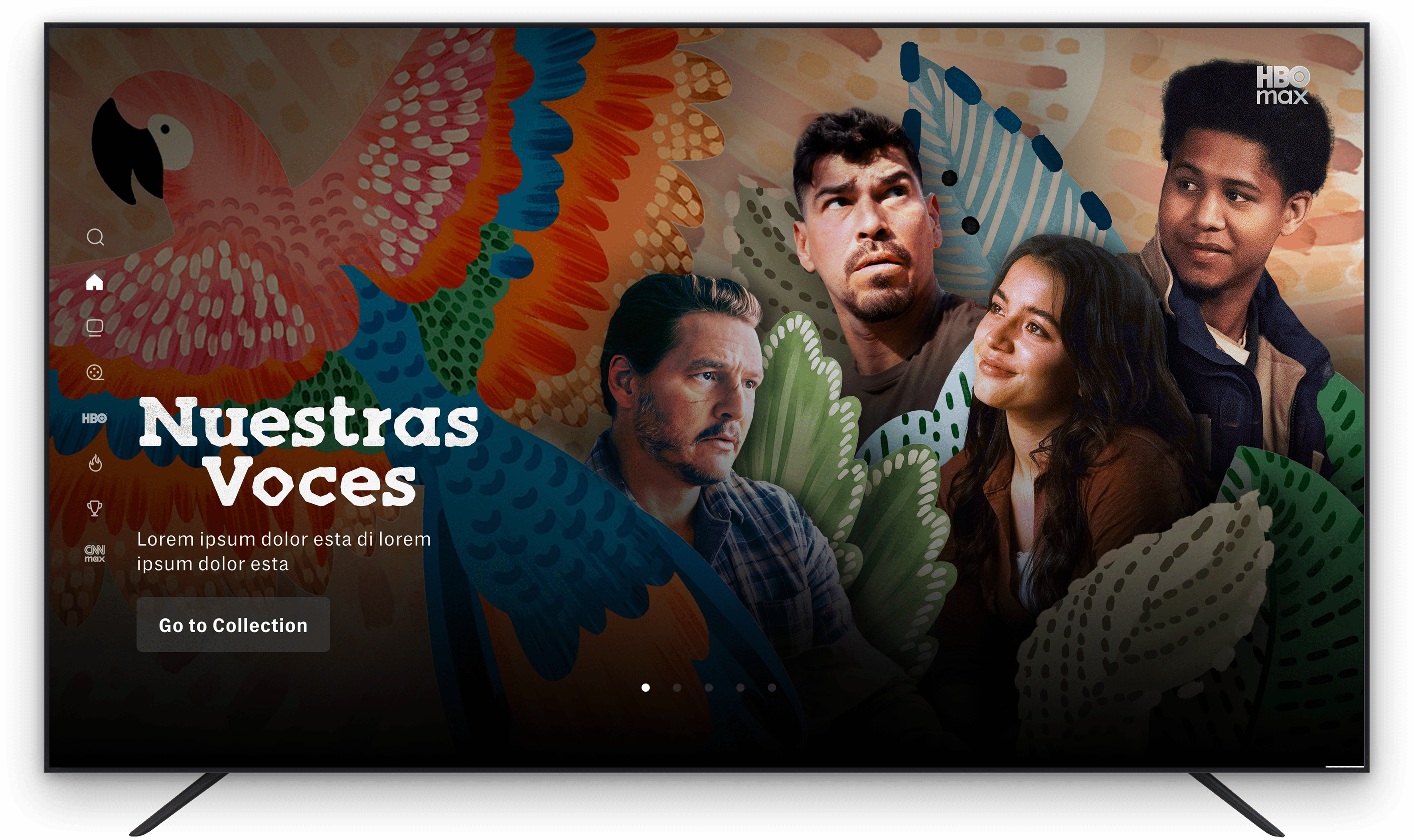
Concept #4 - Pottery Swashes
This concept drew inspiration from Latin pottery and ceramic tiles, using flowing swashes to frame the talent in a way that felt elegant and intentional. The layered forms helped create depth while naturally guiding focus toward the talent. I preserved a slightly rough texture throughout to add richness and dimension. This direction was ultimately selected as the final concept and launched across all HBO Max platform touch points.
Final Design System
Once our direction was approved, I built out a flexible and scalable design system in Figma that could be applied consistently across all HBO Max touch points. Working in Figma allowed for efficient iteration, clear collaboration, and precise control over layout, spacing, and device-specific safe zones.
The final system included designs for:
· Immersive Hero
· Theme Rail
· Collection Tile
· Page Headers
· Collection logos
across CTV, tablet, and mobile.
Each component was carefully adapted to its respective format, ensuring visual consistency, accessibility compliance, and legibility at every scale. The system was designed to support both talent-driven and non-talent screens while maintaining a cohesive visual language throughout the campaign.

Results
The Latino History Month campaign successfully launched across the HBO Max app, delivering a culturally thoughtful and visually cohesive experience that honored Latino voices and storytelling. The final designs met all brand, accessibility, and cultural review requirements, while providing a flexible system that translated seamlessly across devices and screen types.


