
Project Overview
Over the course of a year, I co-led the visual design of new Genre Tiles for the HBO Max platform. This long-term initiative was part of a broader effort to align with the promotion of Product’s new Nano-Tile feature. With the goal of enhancing content discoverability and improving user engagement through more intuitive and visually distinct genre representations.
My Role & Process
The Challenge
If you’re familiar with HBO, you’ve likely been held hostage by its many rebrands at some point. I’ve had the distinct honor of working through three identity phases so far:

It’s professional whiplash at times—but hey, that’s showbiz.
Working at a company that seems to have a quarterly identity crisis comes with its own set of challenges. We’re not always looped into upcoming changes from the C-suite, but when we are, we try to see them less as rejections and more as redirections. This project is a prime example of how to stay creative, flexible, and patient amid change.
The project evolved gradually, shifting in intensity each quarter based on fresh user research and updated product goals. Each phase brought new directives from leadership, which meant rethinking the design direction not once, not twice, but three times. The result? Three jam-packed Figma files overflowing with iterations and concepts.
I worked closely with a co-designer, each of us exploring separate directions and reviewing them together. For this case study, though, I’ll focus solely on my own contributions.
Don’t worry, I won’t walk you through every single idea I came up with. But I will show how our priorities shifted over time and how those changes shaped the final outcome. The scope grew each sprint: we started by designing six genre tiles, and eventually expanded to include page headers as well.
The first six genres we tackled were: Action, Adult Animation, Crime, Drama, Food & Home, Reality, Comedy, and Audio Description. Our Creative Director and Art Director prioritized these because they offered a balanced range of difficulty. Their experience from a prior year’s sprint taught them that if a design could handle the complexities of Comedy, Audio Description, and Action, it could likely scale across the full suite. That made my job particularly tough at the beginning—but once a final direction was chosen, everything clicked into place.
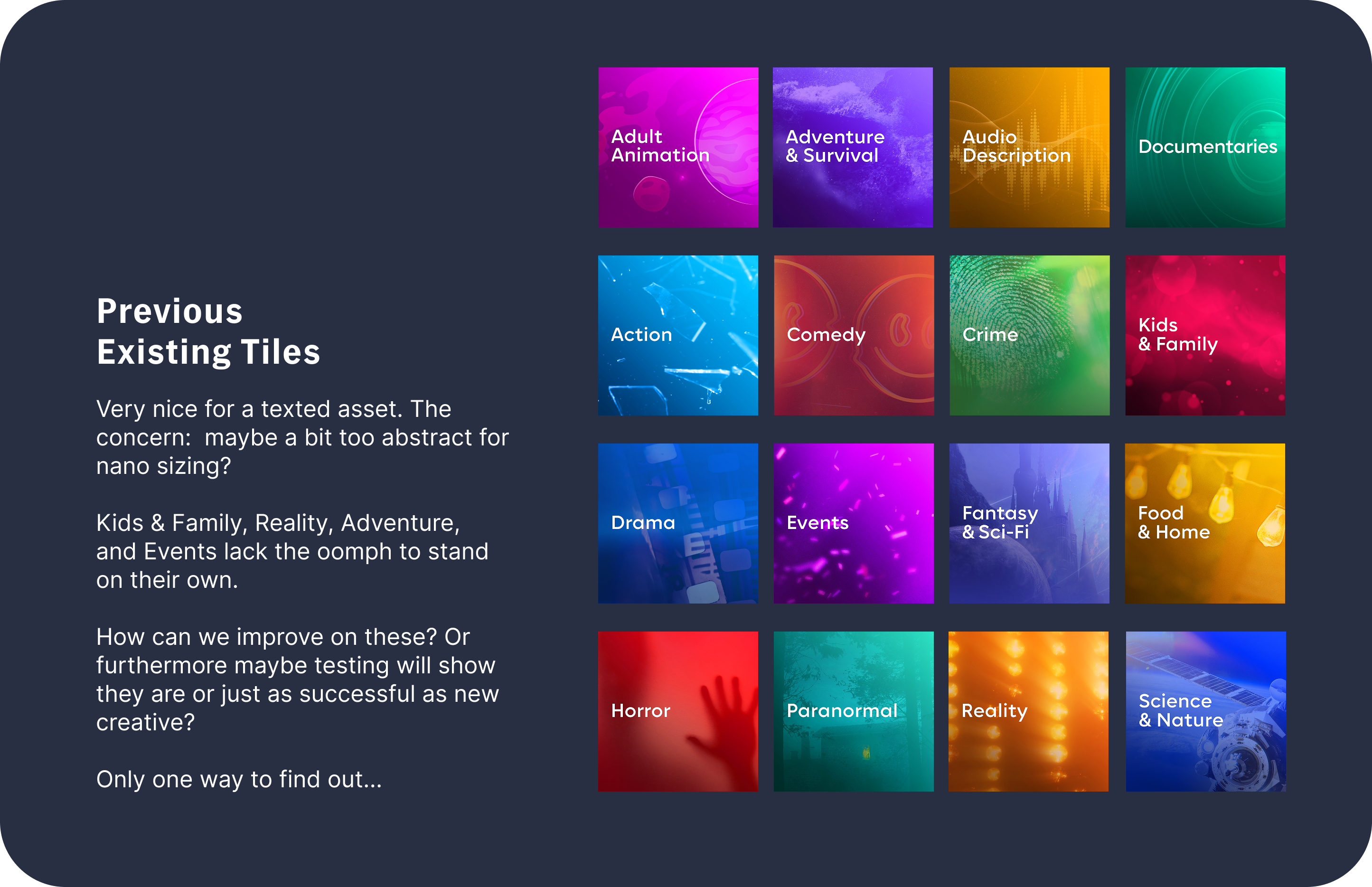
When we first kicked off this redesign, HBO Max was still blue and technically called “Max” (though let’s be honest—no one actually called it that). Throughout all the rebrands and pivots, one thing remained constant: our focus on designing tiles that worked both in the main Genre rail and the nano-tile feature. The nano-tile is exactly what it sounds like—a tiny square. But “nano” just sounds cooler, so we’re going with that. At that size, imagery can easily get lost, and there was growing concern that the existing atmospheric genre tiles wouldn’t translate well when shrunk down.
Sprint #1
So the first ask wasn’t a huge departure- stick with the atmospheric vibe, but make it more... obvious. So that’s what we did. We stayed within the original visual direction—stock imagery with either a monochromatic or colorful burst treatment. This was also my crash course in how tricky some genres can be to represent.
Comedy, for example, sounds easy. It’s not. I tried everything: rubber chickens, finger traps, Groucho glasses, whoopie cushions, smiley faces, drama masks- you name it. Some worked better than others, but my Art Director and I consistently found ourselves circling back to the same question: Does this actually feel like Comedy or did Party City just throw up on this?
This phase was short-lived, and eventually we were told to pause genre work to shift focus elsewhere. Admittedly, this sprint didn’t produce a ton of final assets—but I still think it’s worth shouting out, for the plot and what not.


Sprint #2
A few months later, our redheaded stepchild of a project was resurrected. A brand-new brief came in- completely different from the last. Consider everything above officially scrapped, never to be spoken of again.
This time, the goal was to align with a parallel initiative called “Max Rewind”—think Spotify Wrapped, but for your watch history. Naturally, they wanted the genre visuals to feel cohesive with that project. The Rewind team presented two creative directions, charmingly named:
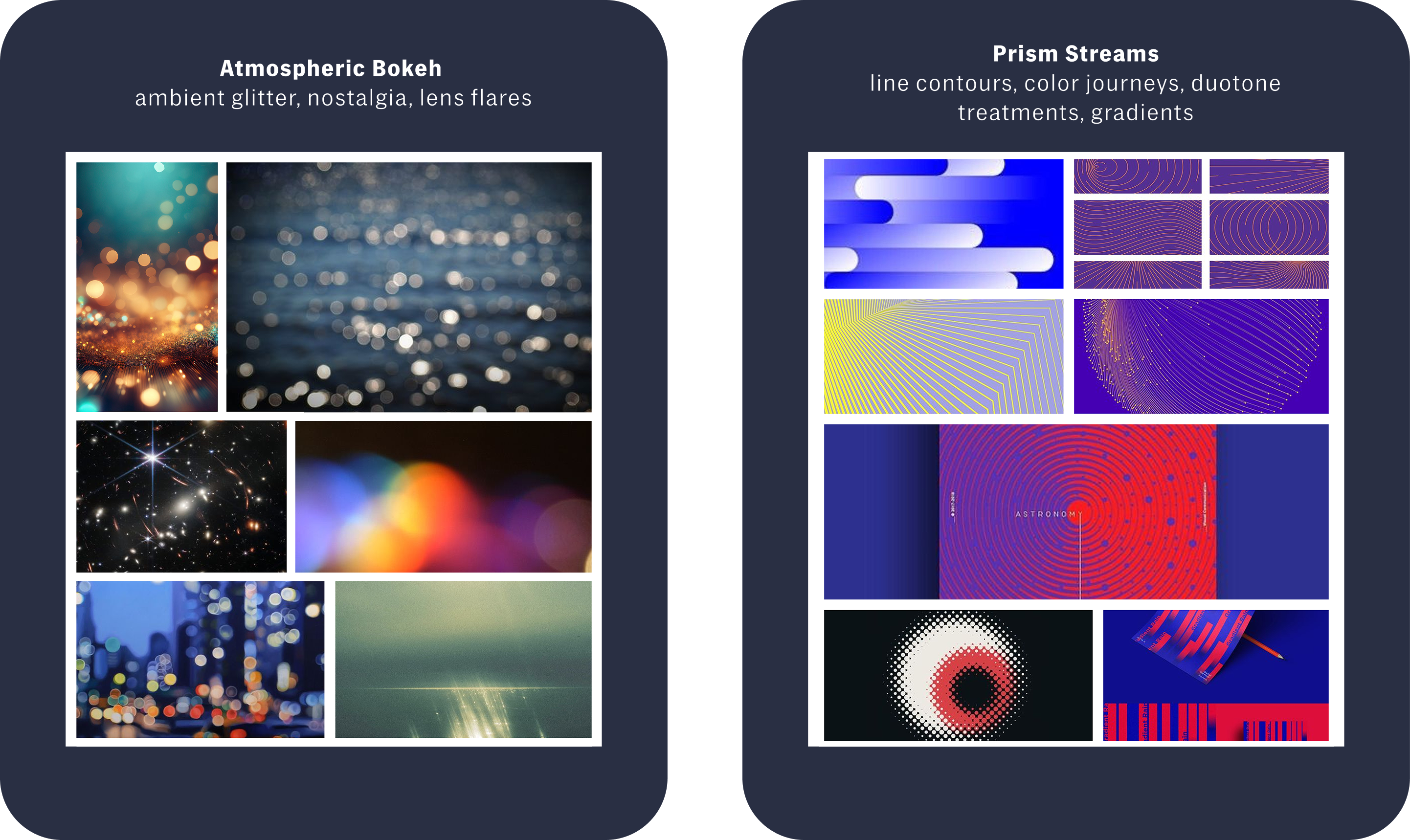
I love my job, but in-house work can be repetitive, and this felt like a refreshing break from bright blue. That said, it came with its own set of challenges. Atmospheric Bokeh wasn’t too far off from where we’d been before, so it felt approachable. Prism Streams, on the other hand, was more aesthetic-driven and a bit at odds with the original goal of improving genre recognition- especially at the nano-tile scale. I loved the visuals I created (they were very pretty), but realistically, they were probably never going to make it to the finish line.
And they didn’t. The Max Rewind project was ultimately scrapped, and with it, any need to keep exploring that direction.
Tapered Lines
Linear Gradient
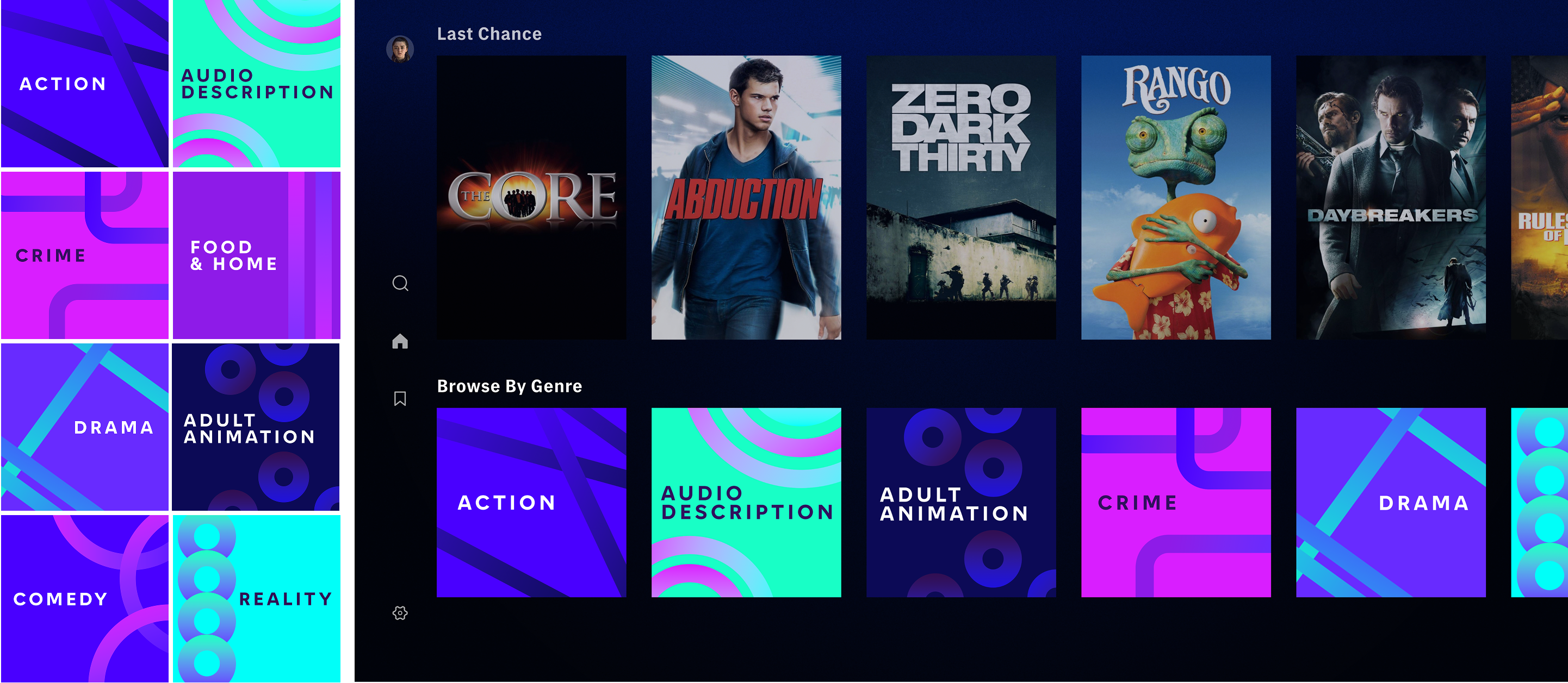
Dots & Lines

With Rewind off the table, we pivoted back to our original goal: conveying genre in a clear, literal way. This made Atmospheric Bokeh—specifically my Texture Bokeh concepts—the front-runner. The thinking was that texture could provide a recognizable visual cue without being overly on-the-nose. And it worked! (For some genres.)
Food, for example? Super identifiable. Comedy? Not so much. “What does comedy feel like as a texture?” is a maybe not so surprisingly difficult question to answer. This is the part of the project I don’t miss and I hope I don’t have to think about “Comedy” as an abstract thought ever again.
Bokeh Colored
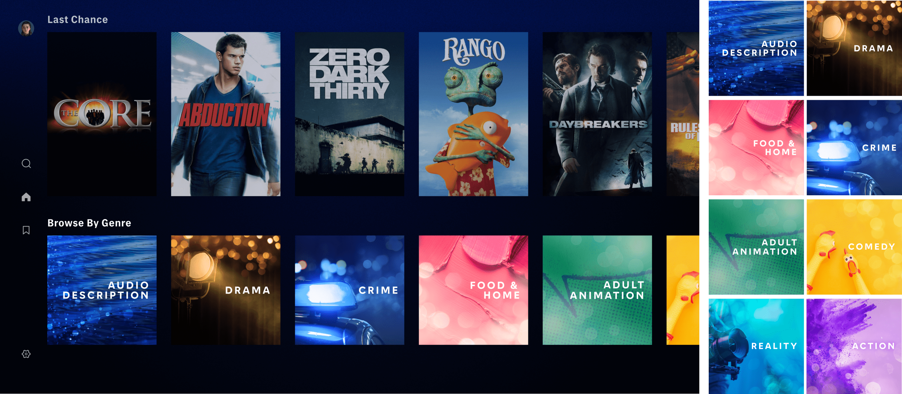
Big Bokeh + Texture

Eventually, the direction leaned more imagery-based and less texture-focused. I liked where it landed. It felt on-brief, visually rich, and genuinely promising....Until our next rebrand, of course.
Refined Big Bokeh + Texture

Refined Atmospheric Bokeh + Texture

Sprint #3
That’s right- the latest rebrand. The one where we went from blue to black. Remember that? That shift meant genres needed to be reframed. Again.
This time, the broader company focus was on making Max feel more elevated and refined. Genres, naturally, became a prime opportunity to help support that ambition. So... we pivoted.
Maybe it was a desperate attempt to salvage some of our earlier work, but we started looking for ways to fold previous concepts into this new phase. At that point, the updated brand guidelines hadn’t been released yet, so we were working in a bit of a vacuum. The only clear directive? It should feel sleek.
My first instinct was to unify the color palette—keep things cohesive now, with plans to adjust once the new look officially dropped. Elsewhere on the platform, we were leaning into dark-mode design, allowing backgrounds to blend into the interface. I wanted these genre tiles to feel like they belonged: clean, integrated, but still eye-catching.
Sleek Dark-Mode Set
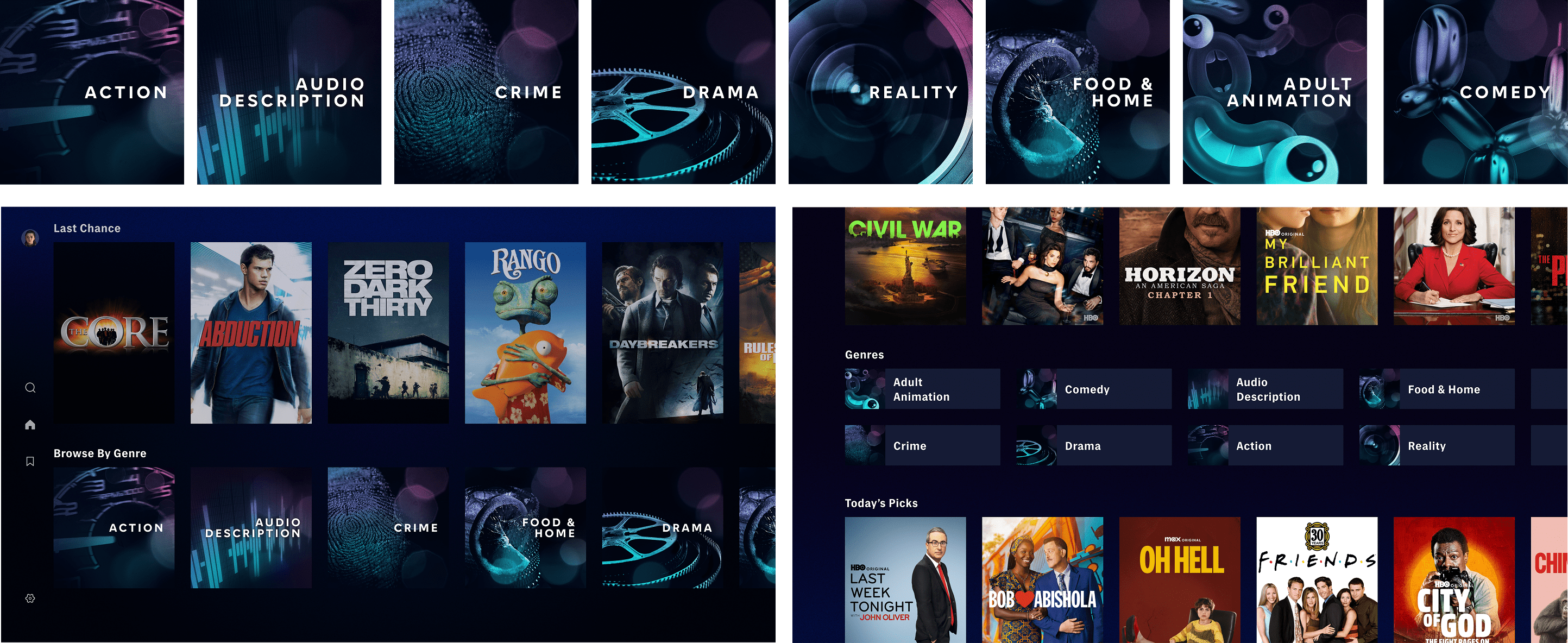
The most exciting part of this new brief? For once, we were actually allowed to use our own IP. Sounds obvious, right? But like with any big studio, using in-house content comes with layers of legal red tape, so it’s rarely the default option. Being given the green light to use WB’s library opened up a whole new set of possibilities, especially for the trickier genres (looking at you, Comedy). When you’ve got a massive library of iconic characters and scenes, genre recognition becomes a whole lot easier.
With that in mind, I developed three primary directions that I felt had the most potential for recognizability and engagement:

Each approach was built around the idea of instant recognition—leveraging familiarity to drive user connection and elevate the experience.
And just like that, we were off and running… until the next big pivot. Naturally.
Talent Focus

Caught Moments
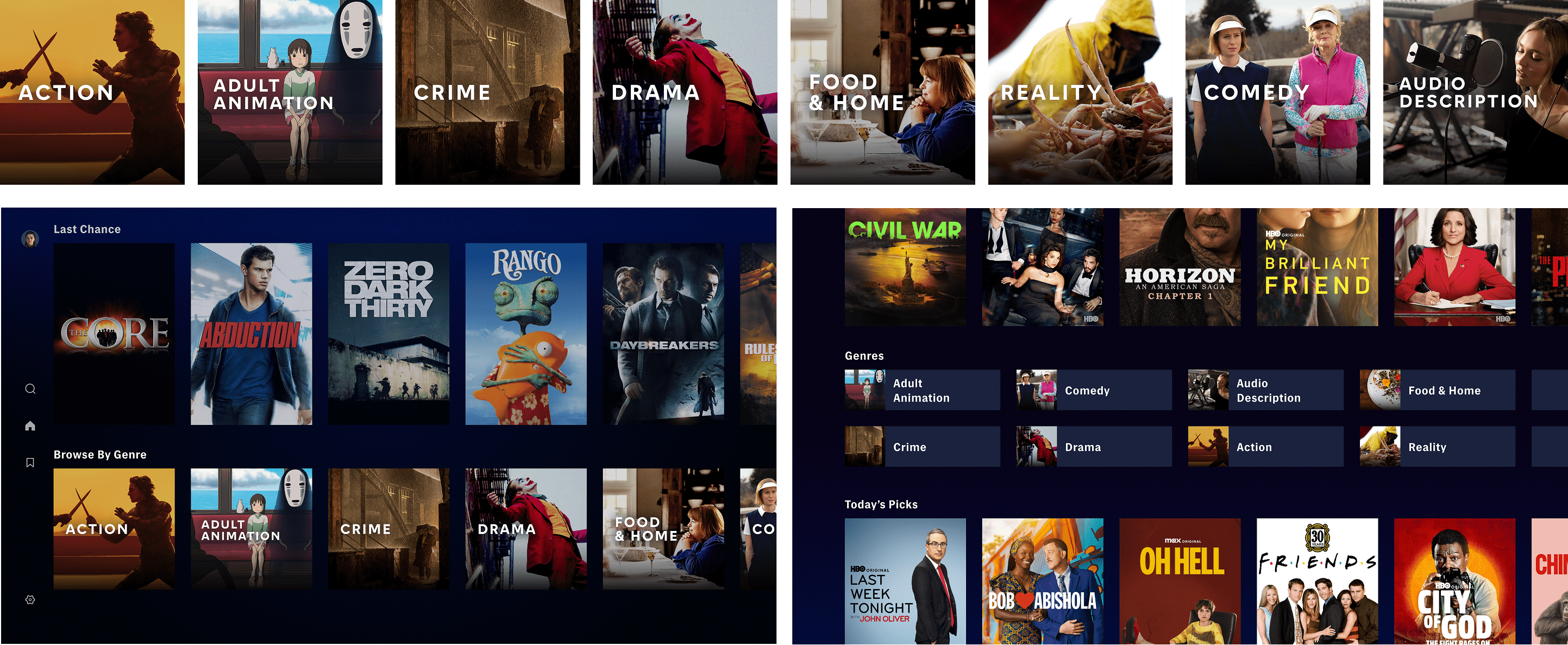
Close Ups

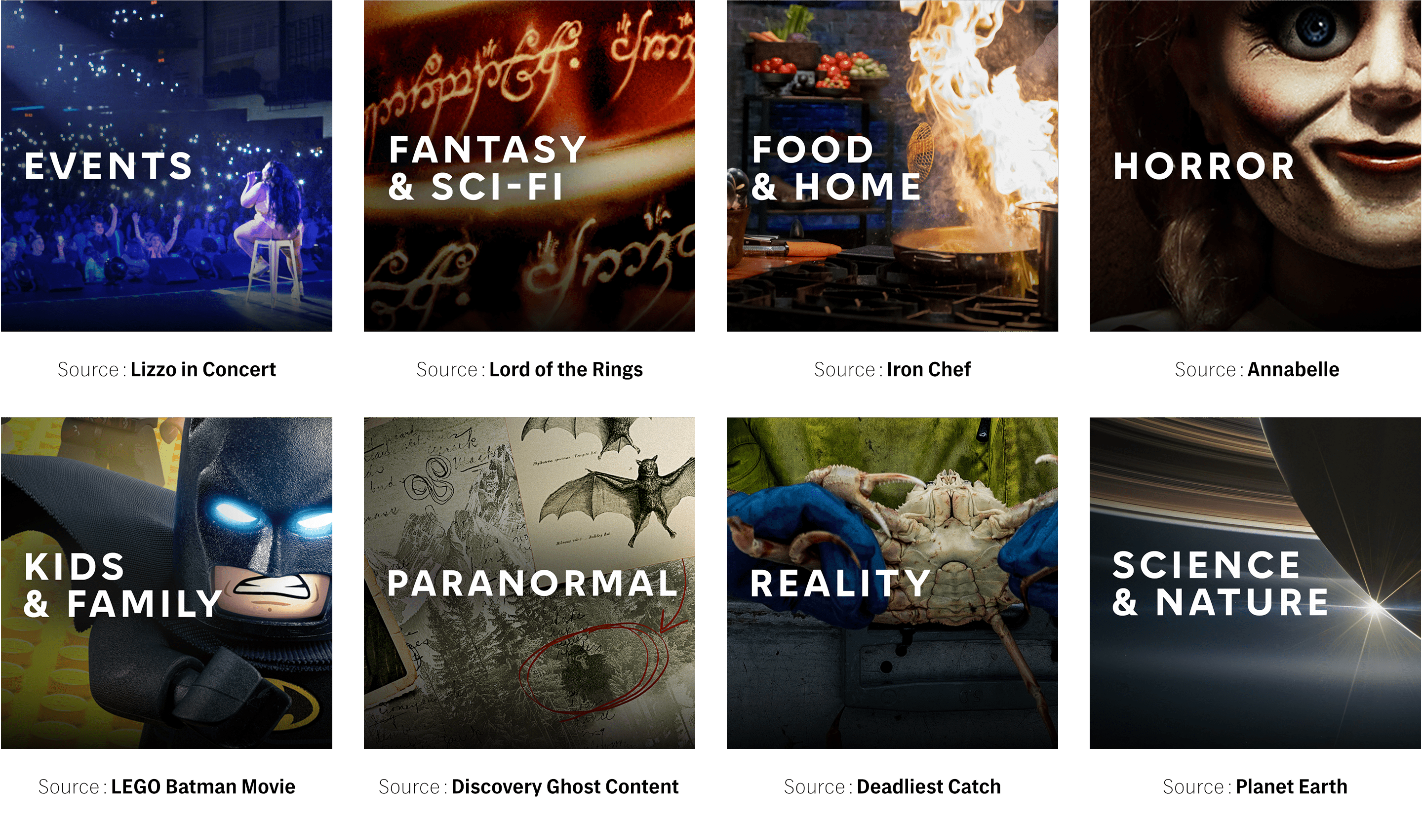
Technically, we finalized on my Close-Up concept—but truthfully, the final product ended up being a blend of all three directions: Close-Ups, Talent, and Caught Moments. I think that mix hit the sweet spot of the original ask: use the Warner Bros. Discovery library in a way that makes each genre instantly recognizable.
The biggest challenge during this phase? Hunting through our many (many) asset databases. It might sound surprising, but finding a clean, usable image of something as iconic as the Bat-Signal wasn’t always easy. There were endless catalogs to sort through, and most of my time was spent narrowing down options—combing through what felt like every corner of the library.
To guide the process, I did a deep dive into each genre on the platform—listing out the most iconic shows and films that had broad audience appeal. I tried to imagine what a fan would want representing their favorite genre. For example:

This tactic was surprisingly fun. While I leaned into legacy titles wherever possible, sometimes the perfect fit came from newer or unexpected content. For instance, I originally wanted The Sopranos to headline the Crime tile-it's iconic, right? But ultimately, we went with a still from True Detective: Night Country. It had the right vibe without being too niche or polarizing. I wanted these visuals to feel familiar but accessible, not alienating for users who hadn’t seen every prestige show in the archive. Some genres were easier than others. In a few cases, I had multiple solid options and had to decide which one was the most impactful. In others... nothing quite worked.
Audio Description was easily the toughest. My initial instinct was to use imagery of someone speaking- since audio descriptions are voiceovers layered on top of scenes—but our Head of Product pointed out that this unintentionally emphasized speaking, not hearing. So we pivoted, searching for imagery that visually communicated the concept of sound. I was elbows deep combing through every show that could potentially have scenes in a recording studio. Not easy, but definitely rewarding once we got there.
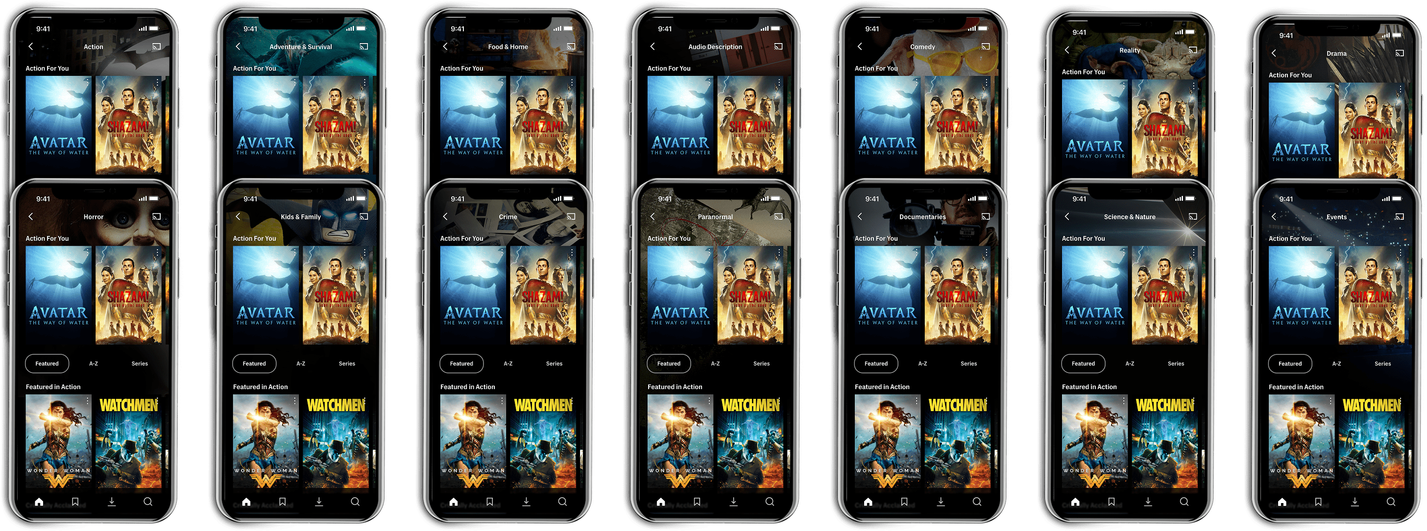
At this point, we had only built six genres per concept. But now I needed to scale that up—to build the full suite of genre tiles and page headers. I edited each photo to feel like its own distinct moment while applying unifying visual treatments to keep everything cohesive.
Watching it all come together was incredibly satisfying. And honestly, it felt liberating to finally expand beyond the original group. More genres, more creativity, more opportunities to bring the platform’s evolving identity to life.


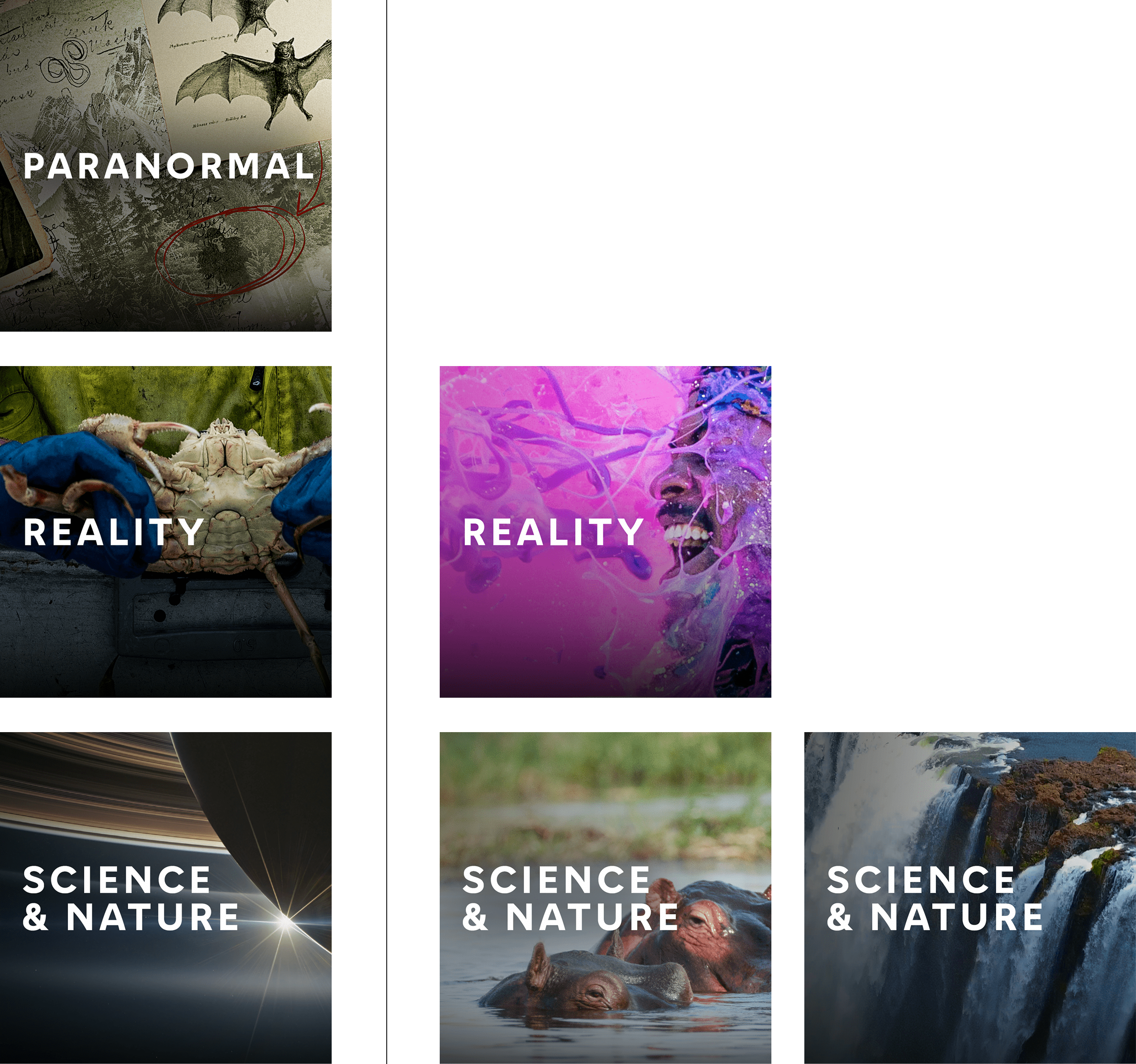
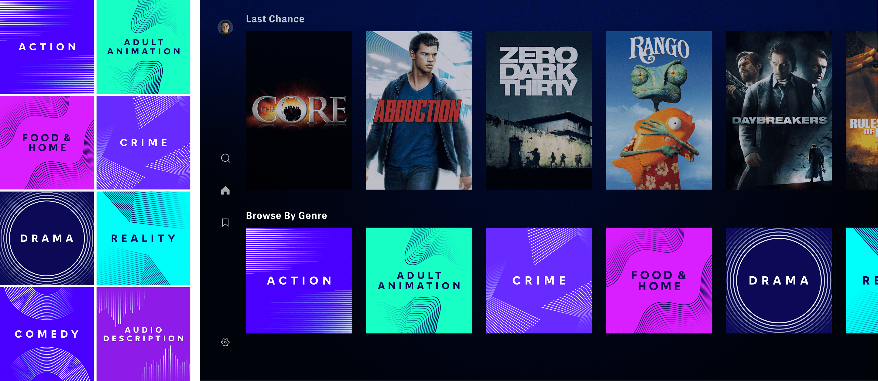
After three sprints, we could finally start finalizing our work. Our head of product and SVP made their final picks and I went to work refining each tile. These were our final deliverables:



A/B Testing
With both my partner’s and my concepts fully finalized, A/B testing could begin. I had the pleasure of working closely with our product team throughout this process. It was incredibly rewarding to see how my design contributions influenced user behavior. While I wasn’t involved in defining the test variables, I’ll include them here to fully illustrate the impact of both our product research and creative efforts.

The first test turned out to be incredibly eye-opening. Product ran a total of seven tests, each with different combinations of testing factors. This initial round compared my partner’s concept against the pre-existing design. In the end, one setup stood out—outperforming in 4 out of 5 key metrics, compared to the average of 3 out of 5. The winning combo?

I’ll admit—it was a little jarring to realize that the whole reason this project started (the nano-tile feature) might not be the right fit. But the silver lining? My partner’s design still beat the original, so the work wasn’t for nothing. That said, I can’t help but wonder what we might’ve created if we hadn’t been so focused on designing for such a tiny space. Maybe that's a test for another day.
After all, this is why we test—to make sure we’re creating the best experience for users. And now we know: while nano-tiles may not be the ideal home for genres, they might just shine in other contexts as the platform continues to grow.
Next up: the second test is already underway—and this time, my creative is up to bat! It'll go head-to-head with my partner’s design over the next 30 days.


