
PROJECT OVERVIEW
Through some wonderful friends, I had the distinct pleasure of being referred for a truly special project. I was commissioned to design an educational children’s board game for a major Investment firm (whom has asked that I omit their name and logo). It was an exciting opportunity to flex my drawing muscles in a completely new medium. I came away with a deep respect for game conception as a whole. I was presented with a fully developed skeleton of gameplay, including routes and card prompts, and my role was to bring the visual story of the game to life.
The end result was Finnyland, home to an adventurous green frog named Finny. In literal terms, the project culminated in a 3x3 foot board game and accompanying cards that company representatives could use for live play in middle school classrooms. The goal was to begin teaching financial literacy in a way that felt fun, friendly, and approachable.
Challenges
The primary challenge was adhering to the company's stringent brand identity while making the game feel whimsical and engaging for middle school students. Financial planning isn’t exactly top-of-mind for 5th and 6th graders. Overall, I had three core challenges to master:

We worked alongside a wonderful third-party non-profit, Impact4Good, employed by the company. Our game master and conceptor, Tom, served as the bridge between myself and the company, offering invaluable guidance and clear direction throughout the process.
PROCESS
#1 Concepts and Moodboarding
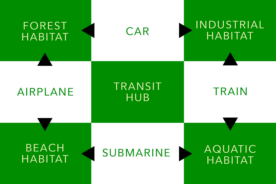
I teamed up with a peer designer, Nona, for the first phase of the project. Our primary directive was that the company's green hues needed to be featured prominently on the board, alongside a predefined structure of distinct “worlds.” Our game master proposed four quadrants representing natural environments, each tied to a specific color, with four literal modes of transportation connecting the hubs.
This framework allowed us to quickly hone in on direction. We pulled reference imagery from Pinterest, drawing inspiration from existing games and children’s illustrations to build our moodboards. Nona was especially thorough in ensuring we had a clearly mapped out and mutually agreed-upon plan before moving into design. She also created this helpful planning graphic:
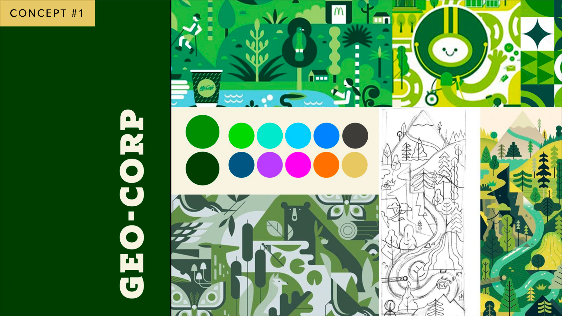
CONCEPT 1 | GEO CORP
Nona led the first concept, working directly within the company’s exact color palette. After reviewing the style guide, we were pleasantly surprised by how saturated and playful their secondary palette was. This gave us a strong range of hues that could appeal to kids while staying firmly on-brand.
She felt a flat, un-outlined aesthetic would pair well with these bold colors. This concept was the most mature of the three, but that was intentional—we didn’t want to underestimate our audience. Middle schoolers can be a tough crowd.
We described this direction as Geometric, Bauhaus-inspired, and commercially aligned. It’s clean, corporate, and polished, while still maintaining a playful edge.
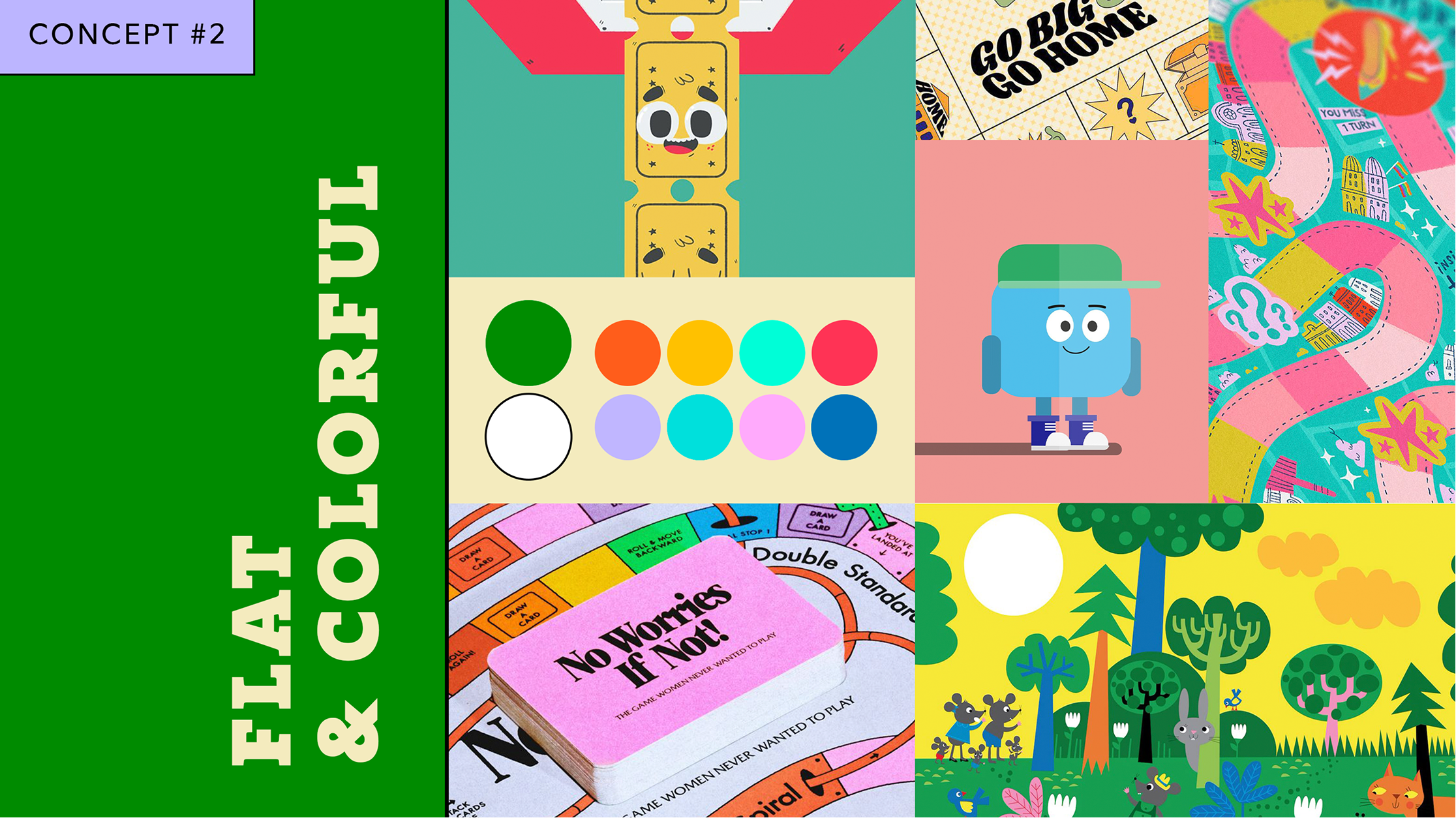
CONCEPT 2 | FLAT & COLORFUL
I focused on the second concept, using the company's main green as the foundation and building a complementary color palette around it. This option leaned into a more current, trendy aesthetic—something akin to a Cartoon Network vibe that I felt middle schoolers might naturally gravitate toward.
It shared the flatness of Geo Corp but introduced added flourishes and subtle shadows. Attention-grabbing without being overwhelming.
CONCEPT 3 | WHIMSICAL EDUCATION
While the original contract called for two concepts, my excitement—and concern about getting this just right—led me to present a third option. I felt that while the first two were distinct, they still shared similarities that didn’t fully showcase range.
Whimsical Education was my attempt to push breadth.I wanted to pull from a science-education vibe, with winding paths and rich detail that might spark a sense of curiosity and adventure.
We described this direction as Painterly, Quaint, Curious, and Quirky. It leaned into a cottagecore-esque, fantastical aesthetic with irregular shapes, texture, and a hand-drawn feel—inviting kids into a world of exploration.

FINAL CONCEPT | BOLD & BRASH
Tom and the company were thrilled with the concepts, but the most important opinions were the kids’. Tom had the resources to survey a small group of families to see which direction resonated most. The results came back with Concepts 2 and 3 tied for first, along with a note that the company wanted to utilize their full color palette.
The final direction became a blend of all three concepts. As expected, this was a challenge—but one we were determined to tackle. Tom offered insightful feedback on my Cartoon Network-inspired direction and suggested looking to illustrator Genndy Tartakovsky as a reference. I’m a huge fan of his work, and it was the perfect lens for marrying flat graphic shapes with organic, expressive elements. This became the final concept presented to the company:
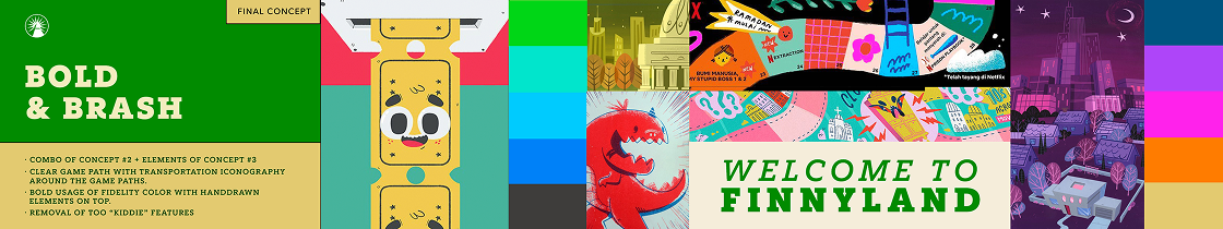
We committed to bold, flat swaths of color as the foundation, layered with hand-drawn detailing on top. Our instinct not to make the game feel overly “kiddie” proved correct—the surveyed kids didn’t want to be babied either. At this point, my wonderful collaborator Nona went on maternity leave, and I took the reigns solo. I could see the vision clearly, but blending all three styles—especially with such bold, saturated colors—was no small task. Still, I was excited and ready for the challenge.
#2 ILLUSTRATING
VERSION 1
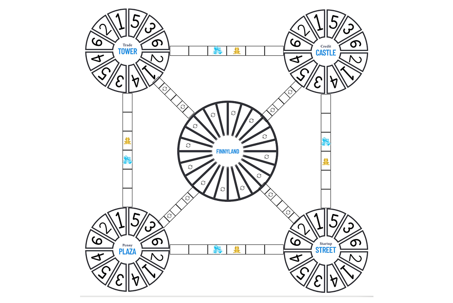
We agreed that I would begin by illustrating the central hub and one quadrant to ensure alignment on style and direction before expanding to the full board. This also allowed me to establish recurring elements such as freeze and gold spots. I was most inspired by the aquatic quadrant, which we agreed would clearly own the blue hues. This was also where I brought Finny the frog to life.
My primary concern was flow—how each world connected and interacted with the others. Each quadrant needed equal representation, and I quickly realized I had less space than anticipated. Paths and spaces needed to be large and legible for actual gameplay, making clarity the top priority. The illustration needed to be exciting, but ultimately function as a backdrop to play.
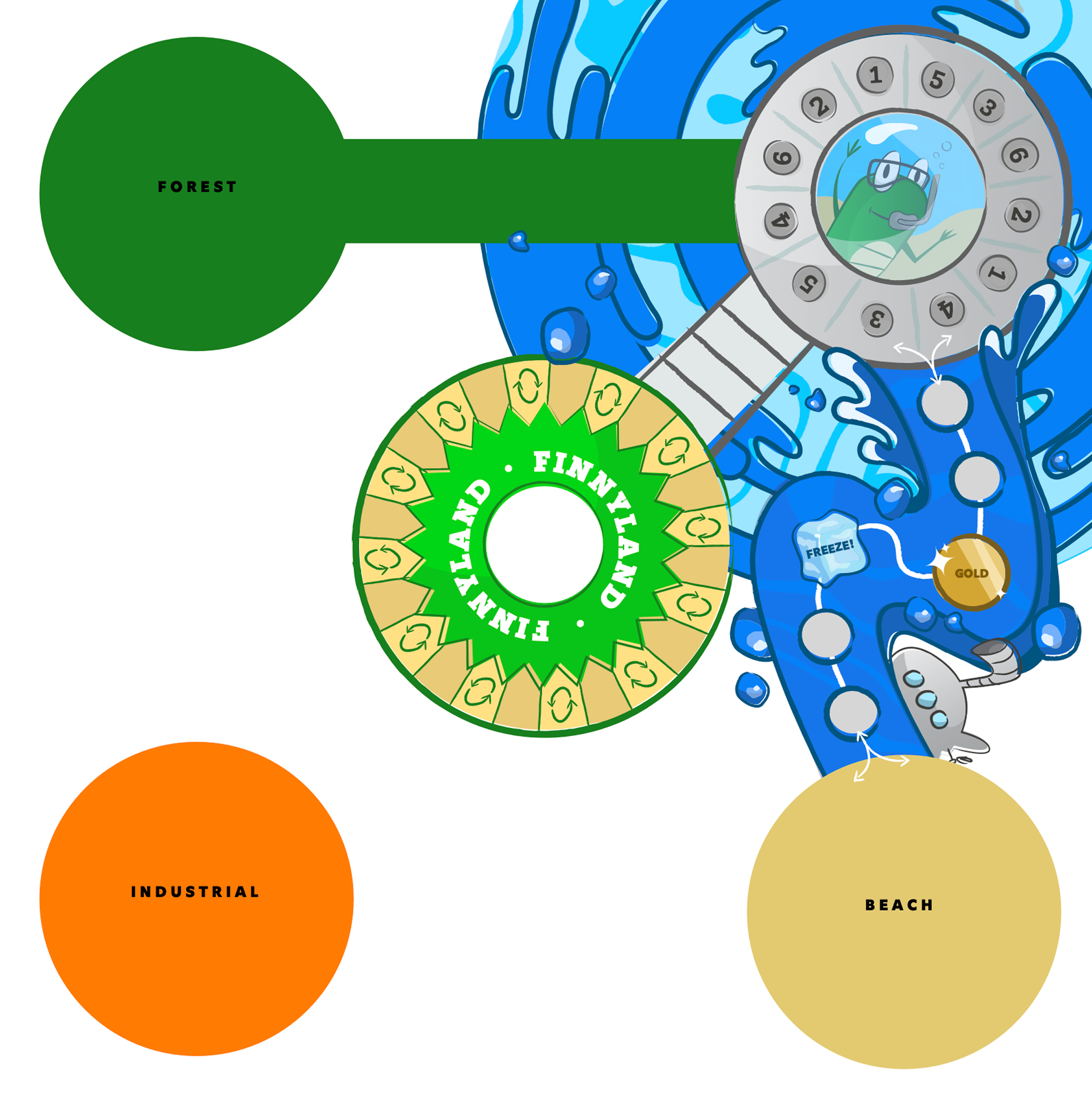
This first pass was sent to the team for review. I loved the direction, and the team saw the potential as well. Their feedback encouraged me to push further: more detail, more creatures, and more whimsy. This opened the door to richer color storytelling. While the aquatic world remained predominantly blue, I introduced subtle accents from neighboring worlds—pulling pinks and purples from the industrial sector into fish and octopus details.
This version was approved enthusiastically, and I was cleared to build out the rest of the board.
FINAL VERSION
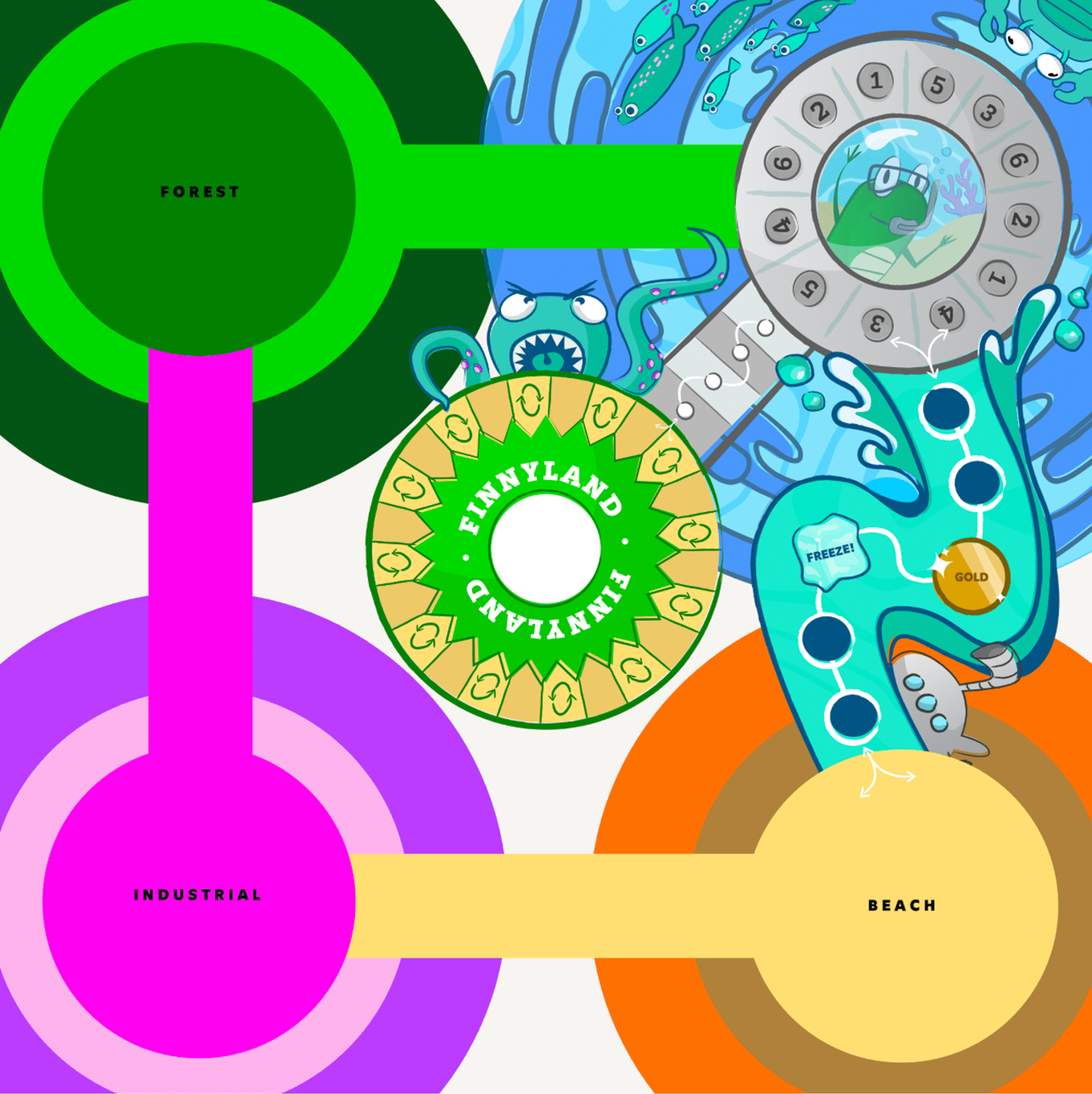
In the aquarium quadrant, I established the idea of each world branching outward from the central circular hub. This created a sense of motion and kept emphasis on the hub itself. The challenge for the remaining worlds was identifying motifs that could support this structure while maintaining visual variety.
Color posed another hurdle. The aquarium benefited from the abundance of blue hues in the company’s palette, but the other worlds were more limited. I also needed to reserve the brightest tones for the connecting spokes so they would clearly stand out, which effectively left each world one color short.
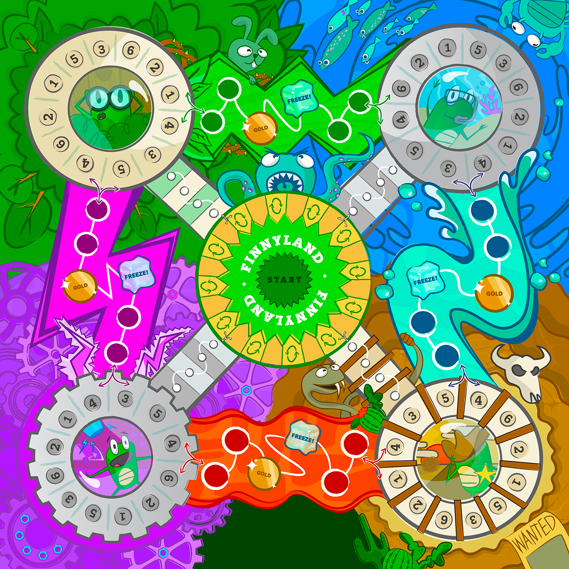
In the end, I created subtle yet contrasting variations within the approved palette. Each quadrant stands on its own while interacting harmoniously with its neighbors. I ultimately chose a desert world over a beach, as browns and taupes felt more cohesive and allowed green accents to shine as cacti. A beach environment would have required water, and I didn’t want the aquarium world to feel as though it was encroaching on another space.
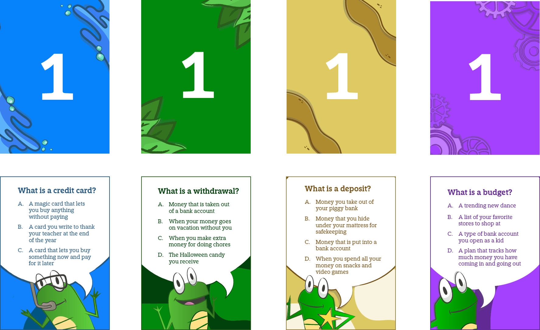
#3 CARD DESIGN
In addition to the game board, I was contracted to design the game cards as well. They needed separate groups to correspond to each of the four worlds, numbered from 1-6. These are my final designs and what each kid will read out loud to their group when it’s their turn. I wanted these to feel like extensions of the board by incorporating subtle elements on the back. The company loved Finny the frog and wanted to see him featured more as well.
KEY TAKEAWAYS
Like any project, I always reflect on my process and how I can improve in the future. This job further emphasized how important it is to be as explicit as possible in the conception phase. A clear direction that both parties can agree on is the most important part of an illustrative process like this. Getting stated approvals for each step can feel a bit excessive but it makes for a more successful product in the end. Especially for something that requires so much compliance and legal checks. It can only help being as thorough as possible.
In Conclusion
This was such a rewarding project that I enjoyed from beginning to end. It was so refreshing to work with a brand that encouraged whimsy and creativity. I think the finished product highlights what one can do within a style guide, as opposed to what limits you. I’m so proud of the board and loved the ability to flex my illustrative muscles once more. I can’t wait to see updated photos as the game starts visiting classrooms.


